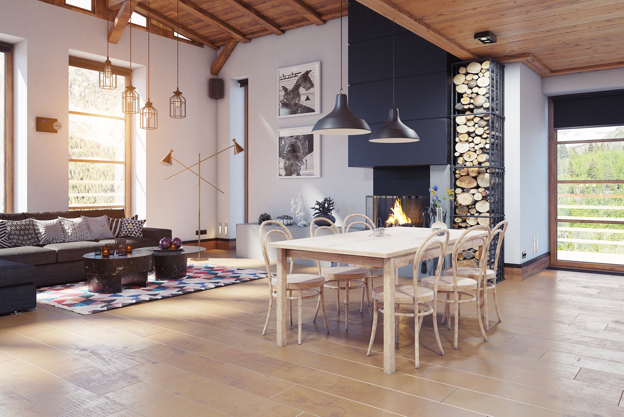
The most common flooring regret sounds like this: “It didn’t look like that in the showroom.” That’s not buyer error. That’s lighting physics plus small sample bias. If you’re comparing laminate across San Diego, CA, America's Best Flooring recommends a real-home evaluation routine because the way laminate reads depends heavily on sheen, embossing, and your exact lighting temperature.
Why samples mislead (the mechanics)
Scale distortion
A small board can’t show pattern repeat, plank-to-plank variation, or how the print reads across a full room. What looks “subtle” on a sample can look busy across 300 sq ft.Showroom lighting is optimized
Many showrooms use bright, even lighting that reduces shadows and makes surfaces look cleaner and more uniform. Your home likely has mixed sources, shadows, lamps, and windows that create directional highlights.Sheen behaves like a mirror
Laminate doesn’t just have a color. It has a reflectance pattern. Depending on gloss level and texture, it can flash bright in one direction and look darker in another.
Hot take: Sheen is often the real “color changer,” not undertone.
Texture terms that matter (and how to feel-test them)
Laminate texture is not purely aesthetic. It affects traction, perceived realism, and how dust shows.
Key technical features to evaluate:
EIR (Embossed-in-Register): Texture aligns with the printed grain. This tends to look more realistic, especially in raking light (light coming in at a low angle).
Overall embossing depth: Deeper texture hides micro-scratches better but can trap dust in the grain pattern.
Hand-scraped / distressed textures: Can look premium, but can also read “busy” in open-plan rooms.
Home test: Run your fingertips across the grain and rotate the sample. If the texture and print “sync,” it’s usually more convincing.
Sheen science: what you should test before you buy
Laminate sheen is often described as matte, satin, or semi-gloss, but those labels can be inconsistent between manufacturers. What matters is how it behaves under your lighting.
What sheen impacts:
Smudge visibility: Higher sheen shows footprints and streaks more
Scratch visibility: Matte hides micro scratches but can show oily marks
Room brightness: Higher reflectance can brighten a space but also emphasize seams
Perceived flatness: Gloss highlights subfloor imperfections more strongly
Home test: Place the sample flat on the floor and stand in the “main viewing spots” (couch, entry, kitchen threshold). Look for glare lines and “flash” as you shift left to right.
The lighting variables you must match in your test
1) CCT (Correlated Color Temperature, Kelvin)
2700K to 3000K: warm, cozy, can push floors more yellow/red
3500K: neutral warm, often flattering
4000K to 5000K: cooler, can pull grey/green undertones forward
2) CRI (Color Rendering Index)
High CRI lighting (closer to 90+) shows undertones more accurately. Low CRI can make everything look flat and muddy.
3) Daylight direction
North light is cooler and consistent. South light is warmer and more intense. East and west light change dramatically morning vs evening. Those shifts can make a “safe beige oak” look different twice a day.
Practical move: Test the sample in the room at two times: late morning and evening.
A 15-minute at-home sample test routine (that prevents regret)
Bring at least two close options
Your eye needs contrast to decide. One sample alone is easy to accept. Two samples force you to notice undertones.Put it on the actual plane
Don’t judge it vertically against a wall. Floors are read horizontally with overhead and window light.Turn off one set of lights at a time
Test under:
Daylight only
Overhead lights only
Lamps only
Mixed lighting
Check against your biggest surfaces
Hold the sample next to:
Cabinet fronts
Countertop edge
Sofa fabric or large rug
Wall paint (especially greige, off-white, warm white)
Look for pattern repeat
Ask to see multiple planks or a larger panel if possible. Some laminates repeat visibly, which becomes obvious in open rooms.Photograph, but don’t trust your phone completely
Phone cameras auto-correct white balance. Use photos to compare options, not to “see truth.”
Decision-stage red flags to watch for
A laminate that looks perfect in the store but “plasticky” at home usually has sheen/texture mismatch with your lighting.
If the sample looks dramatically different when rotated, it may be prone to glare.
If seams are emphasized in bright light, ensure subfloor flatness and consider a different edge/bevel profile.
Choosing laminate is not just picking a color. It’s selecting a surface behavior under your real lights, shadows, and daily life. A proper home test makes the final install feel like the sample you fell for, instead of a surprise reveal.
For help selecting laminate that suits your home’s lighting and layout, visit or contact America's Best Flooring. We proudly serve Carmel Valley, La Jolla, Del Mar, Poway, Coronado, Rancho Santa Fe, Solana Beach, East Lake, Chula Vista, La Mesa, Encinitas, Carlsbad, Cardiff, San Marcos, Escondido, Santee, El Cajon, Rancho San Diego, and Ramona, CA and can help you compare samples, finishes, and textures with a real-world evaluation approach.